

"Go into the arts. I'm not kidding. The arts are not a way to make a living. They are a very human way of making life more bearable. Practicing an art, no matter how well or badly, is a way to make your soul grow, for heaven's sake. Sing in the shower, dance to the radio, tell stories, write a poem to a friend, even a lousy poem. Do it as well as you possibly can. You will get an enormous reward. You will have created something" Kurt Vonnegut
Saturday, March 31, 2012
This card was made for a friend who recently purchased some acreage on The Washington Penisula. It's five acres and he calls it his "farm"...LOL I cut, scored and folded a piece of blue gingham card stock to make an A2 size card. I drew the sheep and cow on my computer, and added the wording, then printed it out. I colored the animals and added some grass and cut out the piece and inked the edges roughly. I added this piece to the front of the card with foam dots and tied some blue and white bakers twine on with a little bow. The inside is white....stamped with the word Congratulations. I think it turned out very cute. 
I love the way this one turned out! I used a couple of techniques that I recently learned in the online Chemistry 101 class...there is still time to sign up for it and you won't regret one moment. First I cut a piece of light blue card stock, scored and folded it to make an A2 size card and rounded the corners. Then I made a tag with the Blended Distress/Spritz & Flick Technique. I cut this to fit the card front and rounded all four corners and attached it to the card. Next I cut a piece of water color paper and rounded the corners, then used the Brushless Watercolor Technique with a stamp I had and inked the edges of this piece with Broken China Distress Ink and attached it top of the card. I created the little banner on my computer and printed it out on the same blue card stock I used for the body of the card. After inking the edges of the banner with Broken China Distress Ink, I attached it to the front of the card with foam glue dots. After tying some pretty ribbon around the front of the card and making a bow in it....the card was done. 

Wednesday, March 21, 2012
Flying High
I cut the kites out of chipboard freehand, then covered them with some gingham paper. I took baker's twine and made the kite strings and the little bows on the string, then attached the kites to the card with glue dots. I also "fringed" the grass freehand and attached it to the card with a glue stick. The sun was a stamp I had, which I colored with a marker. Then I printed the sentiment on some white card stock, cut it out and edged it with Wild Honey Distress Ink and glued it to the card. March is usually a windy month, and it makes me think of kites. I hope you like it! 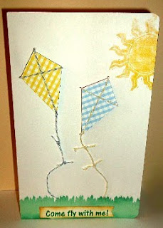

Tuesday, March 20, 2012
Fantastic Class!
I decided to take Tim Holtz's online class, Creative Chemistry 101, and I am thrilled!. It's only day 2 of the class and I have learned so much already. There are videos, downloads and written instructions. There is also a forum to ask questions of Tim if something isn't clear to you. The materials will be available to you for your lifetime, so it's not too late to sign up...I highly recommend it!  This will probably be my only chance to take a class from the Master...and I am sure that is true for many. Don't pass this one up.

Monday, March 19, 2012
shirtty card

Saturday, March 10, 2012
interesting couple of days
It's been an interesting couple of days for me creatively. I saw a pair of shoes I fell in love with...and the colors were neon pink, neon yellow and neon orange. Normally, I don't like pink or orange, but these were just gorgeous. It got me to thinking about the color combination (yes, I get inspiration in strange places...lol). I challenged myself to create a card using only those colors. My first attempt was awful...I had ordered some papers of those colors, but they were not the neon shades...just bright pink, orange and a yellow. I tried color blocks, geometric designs, die cut shapes...nothing worked for me. I got some neon shades of those colors, thinking perhaps it was the faded colors that put me off. Again, I tried several things, none of which appealed to me. Needless to say, I hit an all time high frustration level over this. I did a lot of cursing, some crying, some "poor me, I will never be good at this", etc. Then I sat back and did some thinking. Okay...I love these colors on the shoes, but I do NOT like working with these colors, and the only person I have telling me I have to work with them is myself. So I gave myself permission to NOT work with those colors anymore. Then I decided the best way to get over this mess was to create something I DO like. And this is what I came up with:  Simple, but pretty...LOL

Sunday, March 4, 2012
Here's my latest card!..  I used Spellbinder's Nestabilities dies in my Big Shot for both the diamond and the oval, then embossed the diamond with my big shot and a cuttlebug embossing folder. I then used Faded Jeans Distress Ink and inked the edges of both die cuts. I attached the diamond to the blue card shock with glue dots, and used a tape runner to attach the oval to that. I had the butterfly/believe cardstock sticker which I used, and a small blue flower with a blue "pearl" in the center. I am very please with this one. What did I learn? I have to make an envelope to size...LOL. Thanks for looking!

Subscribe to:
Posts (Atom)